Skip navigation

Category Archives: inglot

> It’s official, guys.

I HAVE 1000 FOLLOWERS!
Wooooooot! An awesome giveaway is on the way, and I’m trying to make it very generous. The details will be revealed on Oct. 21st, which is my blog anniversary =) Yaaaay, double joy!
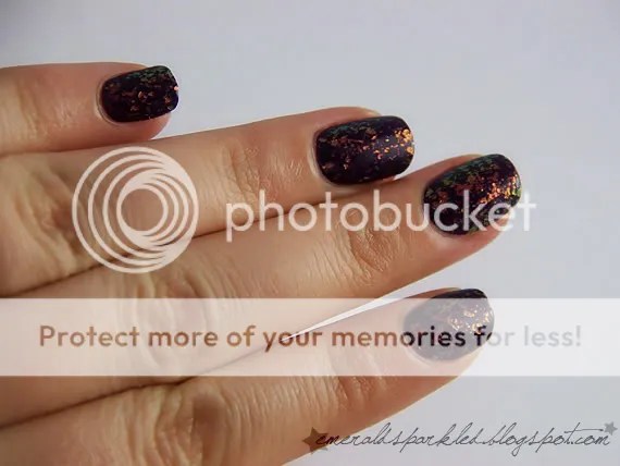
Today is another non-pink, Inglot O2M #644. It’s a teal/green shifting metallic polish. I think it’s similar to Misa Like It Like That, but I’m not sure, since I don’t have that one. O2M line is supposed to allow your nails “breathe” while wearing nail polish. We all know that “breathing” is a lie, as nails are dead cells. If this baby didn’t catch my eye, I wouldn’t even bother looking twice at that line.
Opaque in two coats, dries a bit slow and brushstroke-y, but the gorgeous color makes up for it. It’s no secret that I’m not a fan of Inglot polishes (metallic, frost or pearl only; dragging, streaky…), but sometimes they make awesome and unique polishes, which makes me purchase despite the bad formula.


By the way, just started using Orly Bonder. I want to do a 5-day wear test with a creme polish, let’s see if I can survive with the same polish on my nails for that long =D
Pink nails will continue =) Please forgive my affairs lately =)

Sonunda 1000 izleyiciye ulaştım arkadaşlar. Bunun şerefine büyük bir çekiliş yapmayı düşünüyorum. Detaylar 21 Ekim’de belli olacak, o gün aynı zamanda blogumun yıl dönümü. Çifte mutluluk yaşıyorum yani =P
Bugün yine pembe olmayan bir oje var tırnağımda, Inglot O2M #644. 02M serisi sözde tırnağa hava aldırıyormuş, böylece tırnaklar sağlıklı falan filan. Özetle saçmalık. Çünkü tırnakların hava almaya ihtiyacı yok, bu tamamen yanıltıcı bir bilgi. Ölü hücre topluluğunun neden hava almaya ihtiyacı olsun ki? Aksine oje altından hava alsaydı, mantar oluşabilirdi tırnakla oje arasında. Tırnaklarım sararıyor diyen arkadaşlar, haberiniz olsun, çıplak tırnağa sürdüğünüz oje kimyasal olarak tırnağınızı boyuyor, hepsi bu. Hep mavi sürün, bak ne oluyor =) Bu yüzden, ojenin altına baz kullanın. Kalyon olabilir, başka bir marka olabilir… Sonuçta bu renk gözüme çarpmasaydı, bu seriye ikinci kez bakmaya bile değmez derdim. Tamamen para tuzağı.
Oje iki katta tamamen opak, biraz geç kuruyor, fırça izleri biraz belli oluyor… Ama renk o kadar muhteşem ki, kurtarıyor. Turkuaz ve yeşil arasında gidip gelen bir renk. Inglot formülünü hiç sevmediğim bir sır değil, ama bazen o kadar güzel bir renk yapıyorlar ki, paraya kıyıp alıyorum.
Bu arada baz olarak Orly Bonder kullanmaya başladım. 5 günlük bir deneme yapacağım, bakalım soyulmayı geciktiriyor mu. Aynı ojeyle 5 gün hayatta kalabilir miyim, ayrı konu 😉
Pembe ojeler devam edecek. Son zamanlarda biraz kaçamak yaptım, affedin =)

> Stupid title, I know, but I wanted it to fit in the theme, along with Banana Cream.


This is Inglot #969, and it drove me nuts. Application was horrible. It looks like the consistency is great, the brush is fine, too, but I guess the problems are caused by the funny pearl finish and horrible drying time. I had serious dragging, even the second time when I started all over, without any base coat. I had to apply 4 coats to make everything smooth, and the cuticles looked all jagged. Some serious clean-up was needed afterwards. I mean, I’m moderately skilled at polishing my nails thanks to this much practise, and if I have trouble, an occasional nail polisher will definitely have some.


I must say I don’t like the tonal pearl finish. It makes the polish dull and milky, and takes away the shine quite a bit. It was not so obvious in the pale yellow I showed you last, but I really wish this one was a cream. The color can be best described as Magic Mint, but a little more muted.


I added some konad on top, using konad white and plate m79. I personally think that Inglot #968 owns this one big time. I don’t recommend it, as there are many beautiful mint green polishes out there, with better formula.

Bugün sıra Inglot #969’da. Sürümü çok çok kötü bir ojeydi, beni deli ettiğini söyleyebilirim. Yapısı ne çok akışkan, ne çok yoğun ama bir şekilde hiç güzel sürülmüyor. Sanırım sorun ojenin geç kurumasıyla ve inci bitişli olmasıyla alakalı. Ojeyi iki kez baştan sürdüm, ikincisinde altına baz kullanmadığım halde tırnak diplerimde açılmalar oldu. Doğru düzgün olması için 4 kat sürmek zorunda kaldım. Sonrasında da temizleyip düzeltmekle uğraştım bir o kadar da. Eğer ben bu kadar oje sürme tecrübesiyle sürerken zorlandıysam, ara sıra süren birinin çok daha fazla zorlanacağını düşünüyorum.
Bu arada Inglot ojelerinin hep inci yapıda olmasını sevmiyorum. Bence ojeye derinlik vermek yerine ışıltısını azaltıyor ve süt gibi, donuk bir görünüm veriyor. İlk gösterdiğim sarı çok açık renk olduğu için bir sıkıntı yaratmıyordu, fakat bu oje için iyi bir seçim değil. Bence krem yapıda olması gerekirdi.
Sonra üzerine beyaz konad ojesi ile m79 diskindeki deseni uyguladım. Bence Inglot #968 bu ojeye on basar. Daha güzel nane yeşili bulmak istiyorsanız, Essie’ye bakın, neredeyse aynı fiyat. Üstelik formülü Inglot’dan çok daha iyi.

>Inglot has released two collections recently, one titled “Grey Collection” and the other one “Pastel Collection“. (For more info, click on the Collection names.) I got two colors from their new Pastel Collection, #968 and #969.


Today, I have #968 on my nails. It’s a creamy, stark, cool toned yellow and I adore it. It’s the palest yellow in my stash, and it looks awesome. It has a subtle shimmer to it, but on the nails it looks like a cream. The application was a bit troublesome, I had cuticle drag, and although the opacity was fine with two coats, I had to apply three to make everything smooth. Drying time was average.


The closest description of this color would be: “Between Lemon Chiffon and Canary“. The color was hard to capture, ıt’s not as muted as it looks on the pictures. It’s like a lighter version of China Glaze Lemon Fizz, but not as neutral and with a bit more green to it. See below:


I love yellows. I love light, pale yellows even more. This is a new instant fave for me. Reminds me of spring, baby chicks, banana ice cream, lemon sorbet, buttermilk, mmmm…. =)

Inglot iki yeni oje koleksiyonu çıkardı, biri Gri Koleksiyonu, biri ise Pastel Koleksiyonu. (Detaylı bilgi için isimlerine tıklayın.) Ben de Pastel koleksiyonundan iki renk aldım, #968 ve #969.
Bugün tırnaklarımda #968 var. Çok çok açık bir sarı, biraz soğuk tonlarda ve bayıldım bu renge. En açık sarı ojem bu ve gerçekten muhteşem bir renk. İçinde çok zayıf bir ışıltı var, bu yüzden krem yapıda olduğu bile söylenebilir çünkü belli bile olmuyor. Uygulaması biraz zordu, tırnak diplerinde biraz sürüklenme oldu, bu yüzden aslında iki katta opak olsa da üç kat sürmek zorunda kaldım. Kuruma süresi ise ortalama.
Resimlerde göründüğü kadar solgun bir renk değil. China Glaze Lemon Fizz isimli ojeyle bir karşılaştırma yaparsak, ondan daha açık renk, onun kadar canlı ama onun kadar nötr bir sarı değil, biraz daha yeşil var içinde.
Sarı ojeye bayılıyorum. Ne kadar açık sarı, o kadar hoşuma gidiyor. Bu ojeyi resmen bayılarak aldım ve favori ojelerim arasına çok hızlı bir giriş yaptı. Bana ilkbaharı, civcivleri, muzlu dondurmayı, daha bir sürü lezzetli şeyi anımsatıyor =)

>Hey everyone =) Last time I tried to franken a purple grey, but then, the idea constantly bugged me. Could I recreate Paradoxal? Which polish could I use to create the hidden shimmer?
I was konading over my last manicure, using She #503. It’s a purple shimmer, but not too opaque. Not too great for konad, but I used it anyway, with roses from m65.


I thought I could use She #503 to create the shimmer of Paradoxal. But when I poured some in the purple grey I mixed, the colour was changed & the shimmer was lost. I fought to bring the color back. Then I thought about adding some pigment eye shadow. The only one with the appropriate color was Inglot AMC #73, so I added about a teaspoon of that.
It’s a bit bumpy, and I hate the texture, I had to use much more than the polish could hold, but I think I’m on the right way to Paradoxal. Observe:


Please excuse the bad pictures. It was so hard to photograph the shimmer in my lightbox, and I took these pictures under my tablelamp. Besides, my Coolpix is nowhere near as Dad’s Pentax, which is now away.


Do you see the purple flash in the bottle?
I know this franken can be something, but I don’t have the material to make a good dupe. Maybe if I had this pigment in polish form, I could have gone that far. But this will have to do until I get my hands on the real deal! 😉

Merhaba =) Geçen sefer gri-mor arası bir renk elde etmiştim ya, işte o günden beri Paradoxal’ın bir benzerini yaratmayı başarıp başaramayacağım kurcalıyor kafamı. Acaba içindeki mor ışıltıyı vermek için ne kullanmalıyım diye düşünüp durdum.
Geçen seferki manikürümün üzerine konad m65 diski ve She #503 ile desen yaparken, aklıma acaba Paradoxal’a kendine özgü ışıltısını bu renk ile mi versem sorusu geldi. She #503 fazla opak olmamasına rağmen, konad ile belirgin oluyor. Yaptığım karışıma biraz da #503 ekledim, başta umut verici gözükmesine rağmen bir süre sonra ışıltı arada kayboldu ve renk de açılmaya başladı. Bir de rengi geri getirmek için uğraştım. Sonra aklıma, pigment far eklemek geldi. Pigment far ışıltıyı verirken rengin açılmasına sebep olmayacaktı çünkü. Ben de sahip olduğum iki mor pigmentten biri olan Inglot AMC #7’den bir çay kaşığı kadar ekledim.
Bir kere yüzeyi çok kötü oldu, çünkü ojeye alabileceğinden daha fazla pigment eklemek zorunda kaldım. Kuruduğunda üzerinde küçük pürüzler oluşuyor. Ama Paradoxal’ın ışıltısına da çok yaklaştım. Resimlerde görebilirsiniz. Resim kalitesi gerçekten kötü, çünkü babamın kamerası şu an uzaklarda ve ışık kutusunun içinde sedefler belli olmuyordu, ben de biraz daha karanlık bir ortamda çektim resimleri.
Sonuç olarak elimde mükemmel bir Paradoxal yaratabilecek kadar malzeme yok. Belki bu tarz bir pigment elimde oje olarak bulunsaydı, içine dökmemle beraber ışıltı belirgin olsaydı ama pürüzler oluşmasaydı, daha iyi bir sonuç elde ederdim. Ama aslına kavuşana kadar bununla idare edeceğim artık. 😉

>NOTE: Updated this mani with some flakies!


China Glaze Orange Marmalade is an orange glass-fleck polish from their 2009 Summer Days Collection. This color absolutely screams “Summer!” =) It’s a bright orange with yellowish-orange glass flecks. The finish really makes it glow. I’m sure this would even look better on tanned skin, but I’m truly happy with it.


It really glows from within! I did three coats, but I still have some VNL, it could be a better idea to layer this on a matching orange, in my opinion.
W/ flash:


Oh, how this sparkles! So lovely! Even better than glitter =D
I can’t believe how fast my nails are growing now that it’s summer. The pineapple mani was only a week ago!

ETA:I applied Inglot #202 flakies over Orange Marmalade. Coral flakies with greenish flash over microglitter gave my nails a foily, Minx-like look. It looks even better in real life =)


China Glaze Orange Marmalade, 2009 Summer Days koleksiyonundan turuncu bir oje. Bu yapıda ojelere “Cam Parçacıklı” deniyor, çünkü sahiden içinde kırık cam parçaları ışıldıyormuş gibi. Bu renk sanki “Yaz geldi!” diye bağırıyor =) Çok parlak bir turuncu, yine sarımsı turuncu mikrosimler var içinde. Sanki içinden ışık veriyormuş gibi. Eminim ki bronz tenlerde daha güzel durur, ama ben kendimde bile çok beğeniyorum.
Üç kat uyguladım ama tam opak olmadı. Bence önceden sürülmüş bir turuncu üzerine uygulamak en doğrusu olur, hem daha az oje harcamış olursunuz.
Öyle güzel parlıyor ki =) Pullu ojelerden bile daha göz alıcı =D
Şimdi yaz geldi ya, tırnaklarımın ne hızla uzadığına inanamıyorum.
Ekleme: Orange Marmalade üzerine Inglot #202 sürdüm. Mercan rengi, yeşilimsi parlayan pullar turuncu oje üzerine sürülünce metalik, Minx gibi bir görünüm oluşturdu. Gerçekte resimden bile daha güzel gözüküyor =)

>I dig so-called “fall colors” in spring and summer, and “summer colors” all winter. I’m weird like that… I guess the “season-coordinated colors” idea is not really my thing…
Just discovered this creme polish and brought it home, thinking it would be almost identical to China Glaze Grape Pop, but it’s significantly darker. It’s called Flor Mar Supermatte #120. It looked lighter under the store lights, and I thought it was only a tad darker, but it’s definitely a different color. It’s also leaning a bit warmer, that’s why it’s not blue in front of the camera.
I did a very simple konad using plate m64 and silver metallic polish.


Same polish, different day, with Inglot #202 and China Glaze Matte Magic on top.


More fun manicures to come!

Ben de bir tuhafım yani, kışın yaz renkleri diye geçen renkleri sürmeyi seviyorum, yazın ise koyu renklere gidiyor aklım. Sanırım mevsimlere göre oje sürmek pek bana göre değil.
Bu ojeyi çok beğenerek aldım, Flor Mar Supermatte #120. Ben China Glaze Grape Pop’a çok benzediğini düşünmüştüm, ama eve gelince aynı rengin biraz daha koyusu olduğu ortaya çıktı. Ayrıca biraz daha sıcak tonlu olduğu söylenebilir. Ben de üzerine m64 diski ve gümüş rengi kullanarak desen yaptım.
Diğer resimde, üzerine Inglot #202 ve China Glaze Matte Magic sürülmüş olarak görebilirsiniz.
Yakında daha eğlenceli manikürlerle buradayım =)

>So long for uneven nails =) I didn’t like the look of them together, so I chopped them all down. Isn’t it what we all do when we have a break? I kinda like this length, though. And they will grow out before I even realize that time passed! =)
Today’s nails are a true mimosa color. Some of you may know that Mimosa was the Pantone color of 2009. It’s a warm, dusty and light yellow, exactly like my nails today.


The polish I’m wearing is Inglot #943. I got it a long time ago, when my polish eye was not as good as it is today. Those days I thought every yellow creme polish ought to look similar. Boy, I was wrong. I’ve had many yellow creme polishes afterwards, and this one is different. It’s not as bright or sunny as others, but a bit warmer and toned down. I really like the look of this polish on me. It took 3 coats to be opaque and even. It’s a bit streaky, but not so much that it requires thinner.


And a quick bottle comparison. From left to right:
China Glaze Lemon Fizz, China Glaze Happy Go Lucky, China Glaze Yell-o Neil, Inglot #943, Gabrini #380 and Claire’s Yellow.
Lemon Fizz is a lighter, sorbet like yellow, Happy Go Lucky is bright, sunshine-y, Yell-o Neil is a bit darker and with glass fleck finish, Gabrini is very close to Happy Go Lucky, maybe a bit lighter, and Claire’s is darker, brighter and more orange-ish, also a jelly.
I hope you like this color =) This year’s Pantone color is even lovelier, Turquoise! =) I love turquoise nail polish =D

>I have seen this idea somewhere, but I just can’t remember where. It could be a blog or flickr, maybe both! =D If the idea belongs to someone you know, please notify me so that I can credit her. Update: Found it!
I actually wanted to give one of my old Inglot polishes another chance. It’s this beautiful, rich blue/purple duochrome microglitter in the bottle, but sadly it doesn’t transfer on the nails. I used 4 coats, but all I got was a generic muted dark blue with barely visible blue shimmer.
I decided to amp it up a bit by sponging China Glaze Ruby Pumps on the bottom, and then green flakies by Inglot on top of Ruby Pumps.


Because my topcoat has gone bad, again, the thing just wouldn’t dry properly. So I stamped with m36 in silver to cover the dents:


Sorry for the upside-down butterflies. (Again!) I always do the konad so that it’s upright when I look at my nails. I also used the small side of the stamper, that’s why some parts of the small butterfly are missing. The image wouldn’t fit, which I realized after transferring the images to my computer.

Giveaway details will follow in the upcoming days!

>Maybe you have realized, I love Butterflies. And bows. Bows are some of my favorite images, especially those huge ones on m59. Unfortunately it’s almost impossible to have them show up as a whole, my nails are too narrow for them. But I don’t care! By the way, I’m getting better and better at completing the missing parts of the images =) But I can only do that with konad polishes at the moment, because with other polishes, I’d have to work at the speed of light =)))
This is a regular red creme polish, layered with one coat of China Glaze Pure Torture, to make it warm and saucy. I love bright, warm reds, so vintage and glamorous! I still need the perfect red, and although it’s a cool one, Bangin’ from the RBL spring collection seems to be just the perfect red for me. I’ll try to get my hands on it, for sure =)
Anyway, I layered the manicure with one coat of Inglot 202 and stamped with m59 and special polish in white. The result:


One day I’ll be able to fit all those bows on my nails! Hear my oath!!! =D

>Here is a basic one before I do my New Year’s mani. I have to admit, I’m amazed at how this magenta/purple and bronze look together. The purple is similar to China Glaze Let’s Groove, maybe looking a bit towards China Glaze Stella. It’s a gorgeous color, and has the same lit-from-within look that China Glaze Retro Diva polishes do. I did the tips with a bronze Inglot polish, and I was about to leave my nails that way, but the Konad monster peeked out as always, and I stamped the nails using China Glaze Admire and Konad plate s06.


They look soo much better in real life than in pictures. And I’m really pleased with my freehand tips! Btw, it doesn’t really show up, but Admire is a cool pink, and compliments the bronze and the purple nicely. =)